Search for answers or browse our knowledge base.


The Application Health Dashboard is the default screen when you log in to HEAL. It shows whether each configured application has ongoing signals. The colors and pod sizes are designed to be readable from 20 to 30 feet, so you can mount the screen on a wall.
Before you start
For the dashboard to show data:
- An admin has configured at least one application and tagged services to it.
- Data collection and processing is running for those applications.
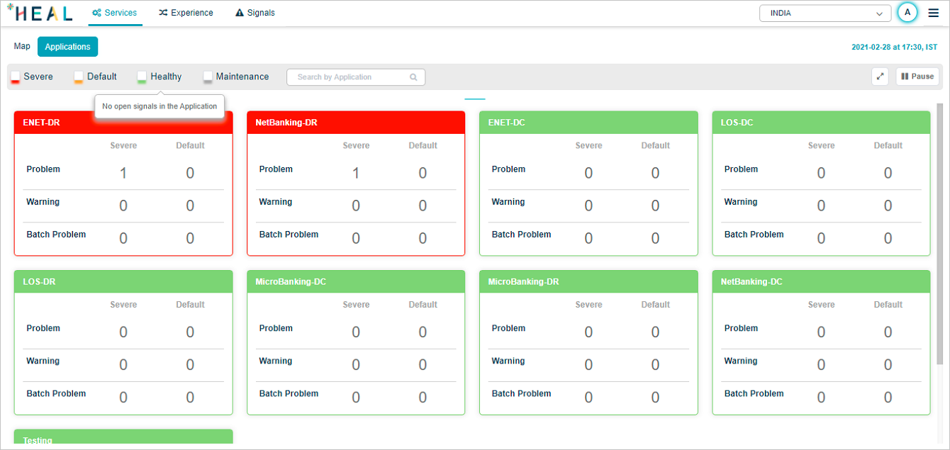
The Application Health Dashboard
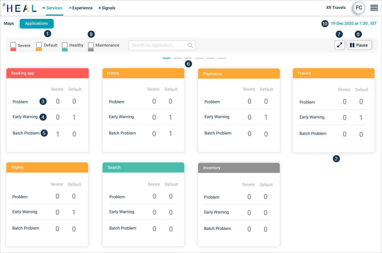
1. Applications. A set of services grouped together. Click Applications to open the dashboard. You see only applications assigned to you.
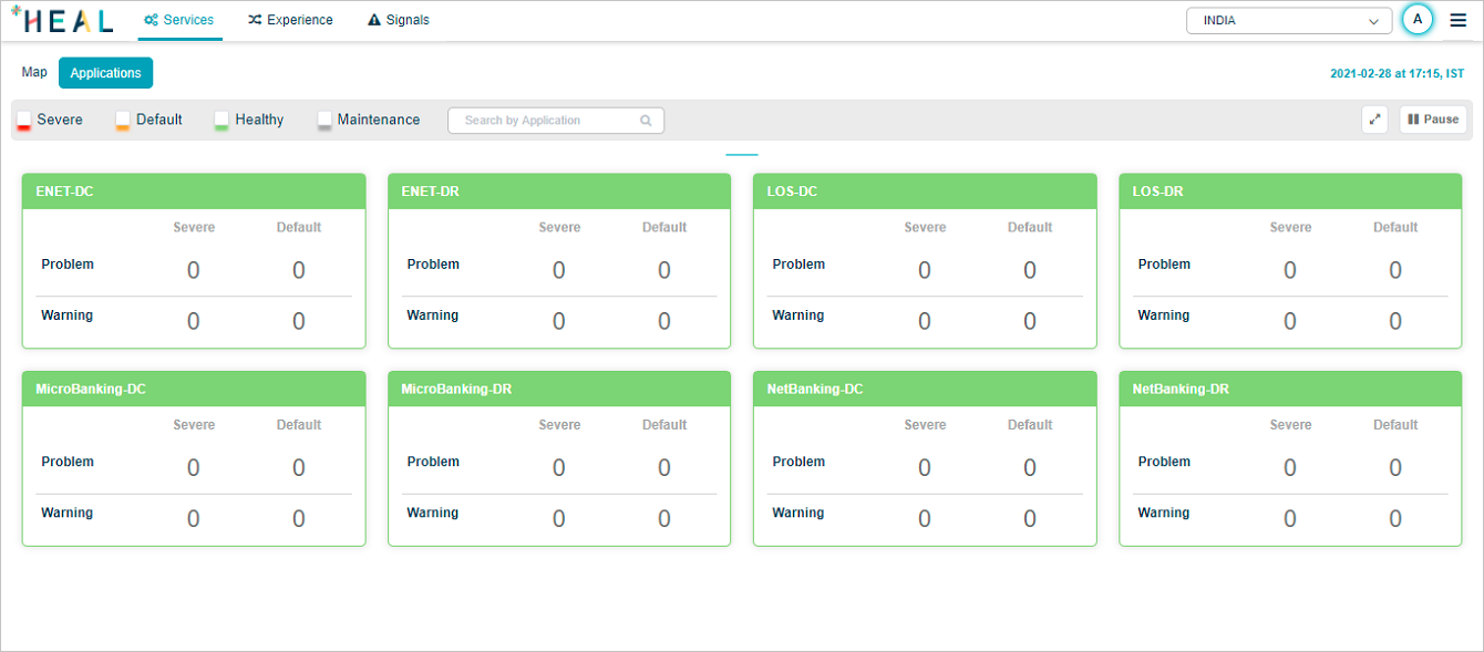
2. Application pod. One pod per application. The top line color shows the status:
- Red. Severe signal active.
- Yellow. Default signal active.
- Green. No active signals.
- Gray. Application under maintenance.
3. Problems. Count of active Severe and Default problems. Click anywhere on the pod to open the Application Health Summary.
4. Warnings. Count of active Severe and Default warnings.
5. Batch problems. Count of active Severe and Default batch problems.
6. Horizontal scrolling. Click the lines to scroll the screen sideways.
7. Full screen. Click to enter full screen. Press Esc to exit.
8. Carousel play and pause. Pods rotate in a 12-per-page carousel. Click play to start, pause to stop.
9. Status filter. Click any status box to show only applications in that state.
10. Just-in-time snapshot. The timestamp on the screen.
Disabled batch
When batch monitoring is disabled, Batch Problems do not appear.
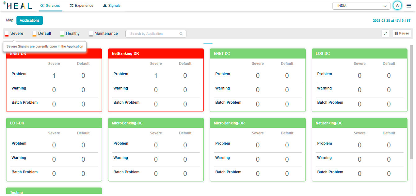
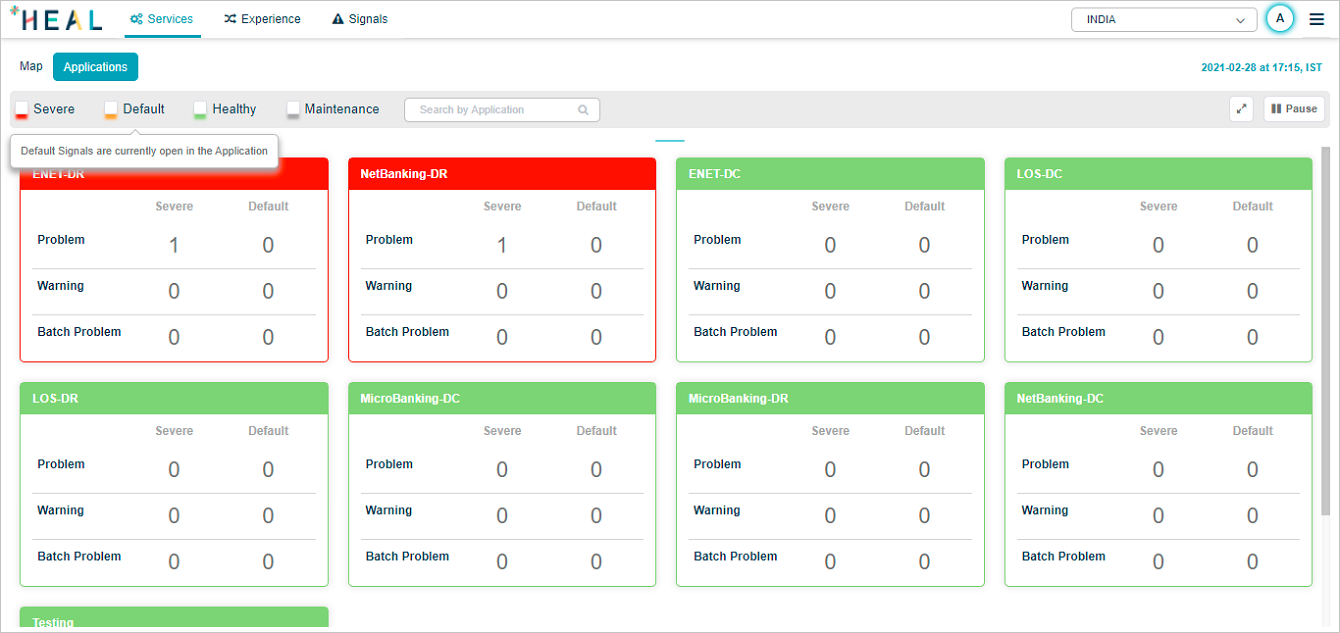
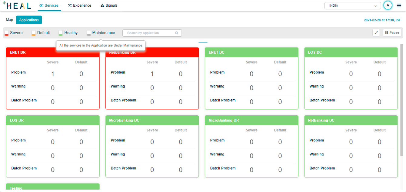
Application status hover
Hover any status pod to see what the status means.
Severe:
Default:
Healthy:
Maintenance:
Pod ordering
Pods sort by status: red first, then amber, then green. Within each color, red and amber sort by descending count of severe or default signals. Green sorts alphabetically.
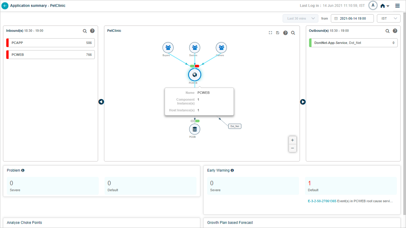
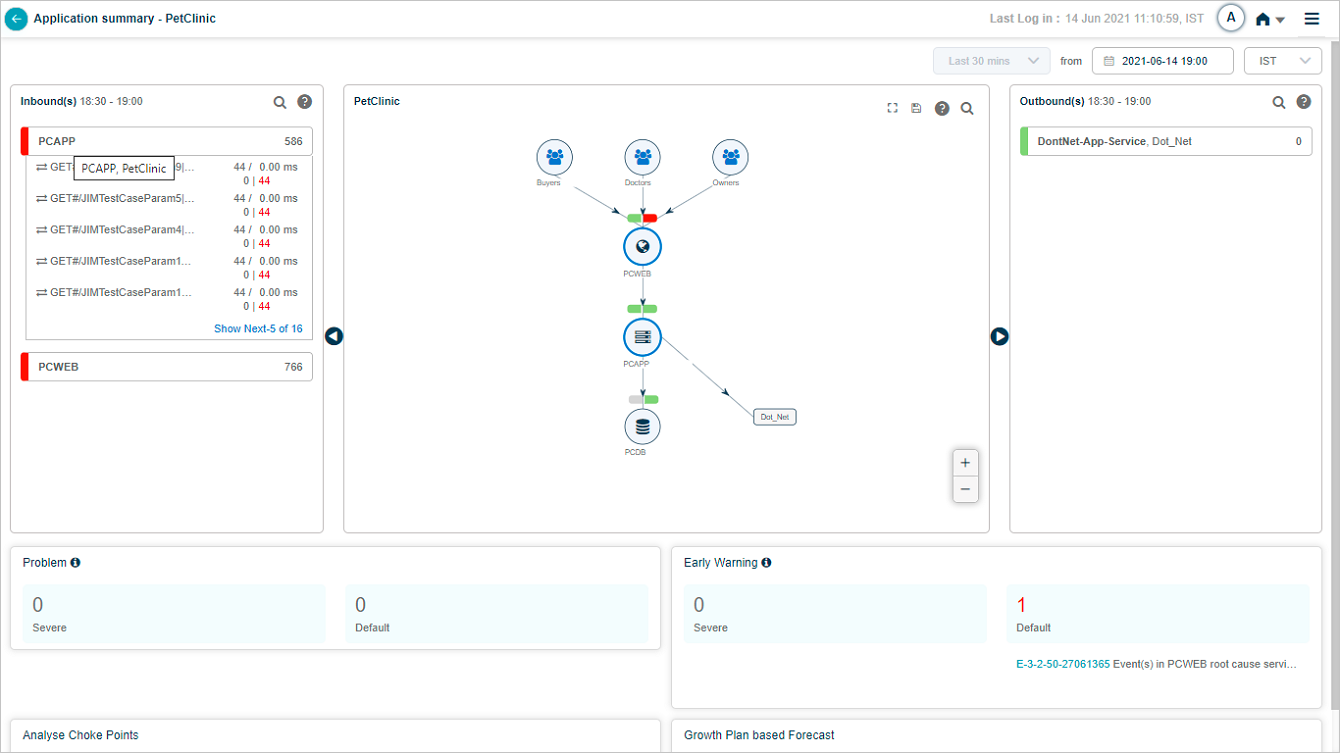
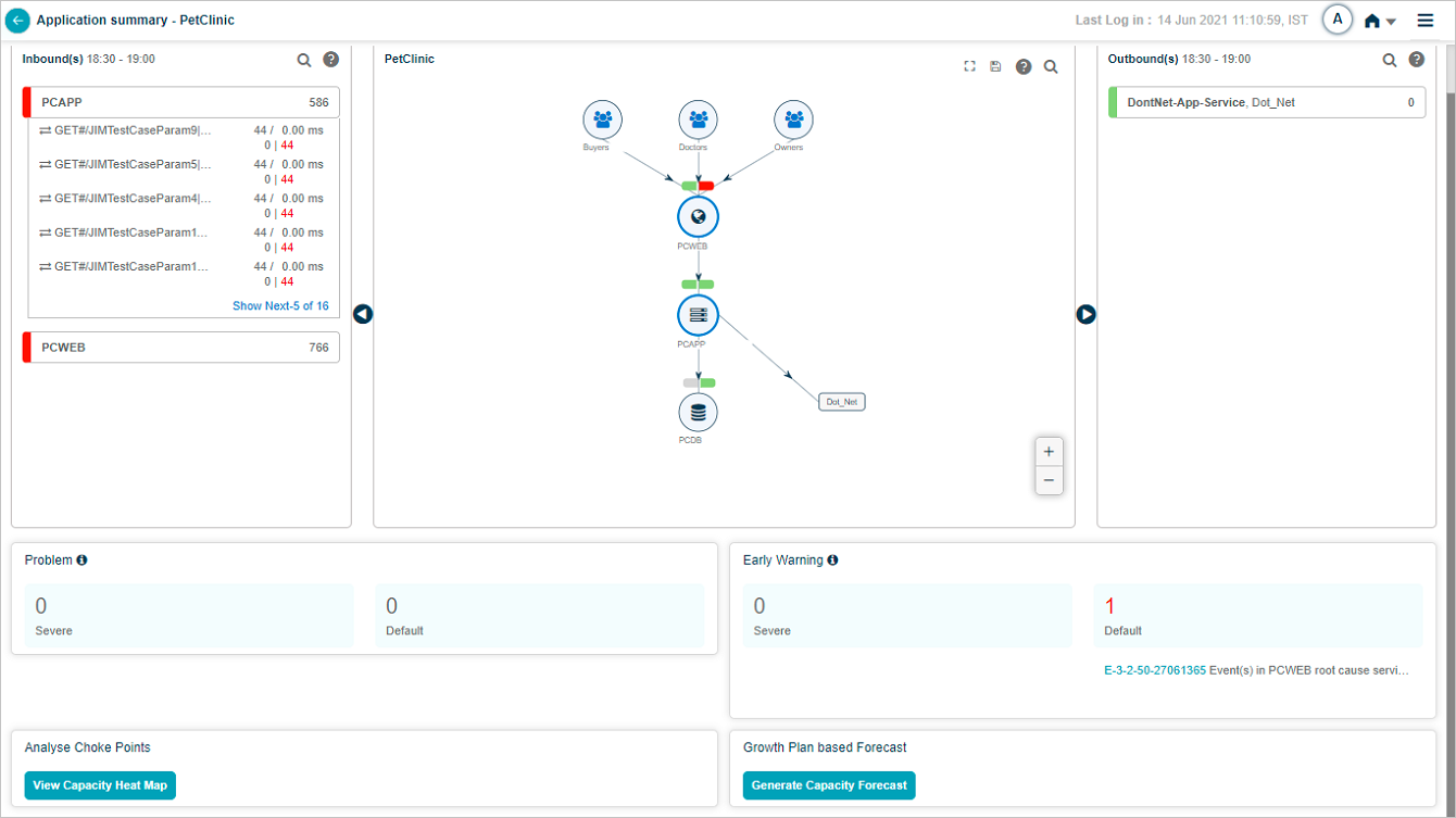
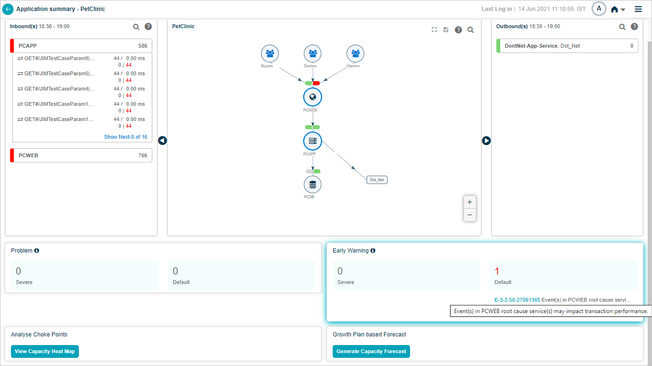
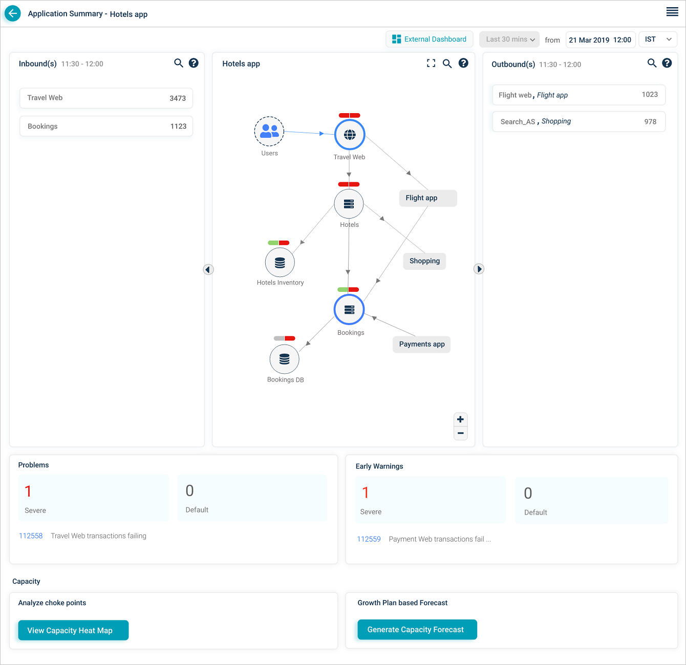
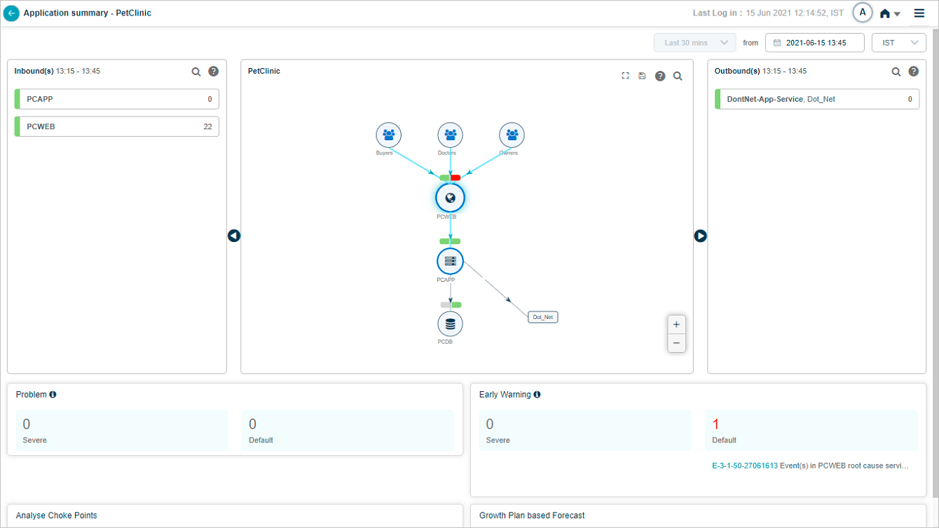
Application Health Summary
Click any application pod to open the Application Health Summary. The Service Dependency Map for that application loads. Data is shown for the current date and time.
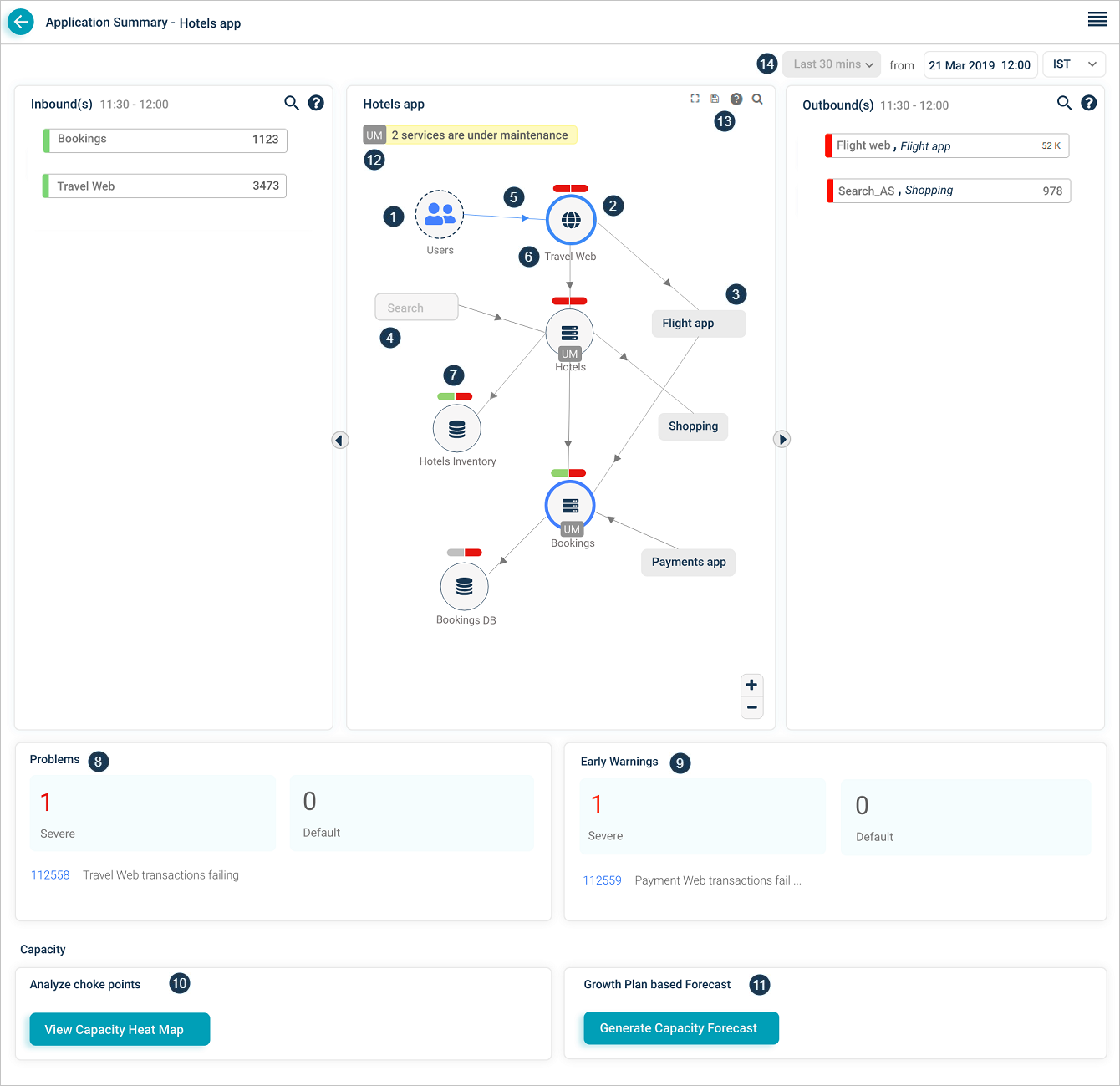
1. External entity. An external user or external service that initiates a transaction.
2. Entry-point service. A service that takes requests directly from external sources, whether HEAL monitors it or not. There can be multiple entry-point services per application, and one entry-point service can be shared across applications.
3. Adjacent application. Services and applications one hop away. Click an adjacent application you have access to and its SDM opens.
4. Restricted application. An application your role cannot open.
5. Inbound traffic indicator. Marks a service receiving incoming requests.
6. Host and component instances. Total host and component instance count for the service.
7. Event capsules. Two-part capsule per service. Left half is workload KPI health, right half is behavior KPI health. Colors:
- Green. No events on the service.
- Red. Events on the service.
- Gray. Service is not being monitored.
For example, if Problem P1 has 5 events with 3 on service S1 (1 workload, 2 behavior) and 2 on service S2 (both behavior), S1 shows both capsules red and S2 shows the workload capsule green and the behavior capsule red. The icon inside the service circle stays the same color regardless.
8 and 9. Problems and warnings. Count, IDs, and short descriptions of active Severe and Default signals (problems and early warnings) whose start or end falls in the selected time range. Click any signal to open its Signal Report.
10 and 11. Capacity Forecasting. Open the Capacity Heat Map or generate a forecast.
12. Maintenance service count. Number of services in maintenance. Services in maintenance show a UM icon. Maintenance can apply to the whole service (scheduled) or to specific instances (ad hoc).
13. SDM toolbar. Fit the SDM to the page after zooming, search by full or partial service name, save the layout.
14. Historical data selection. Pick a previous date, time, and time zone. The screen shows the last 30 minutes of data relative to that timestamp.
Service instances under maintenance
When specific instances of a service are under maintenance, the SDM shows the UM icon next to those instances.
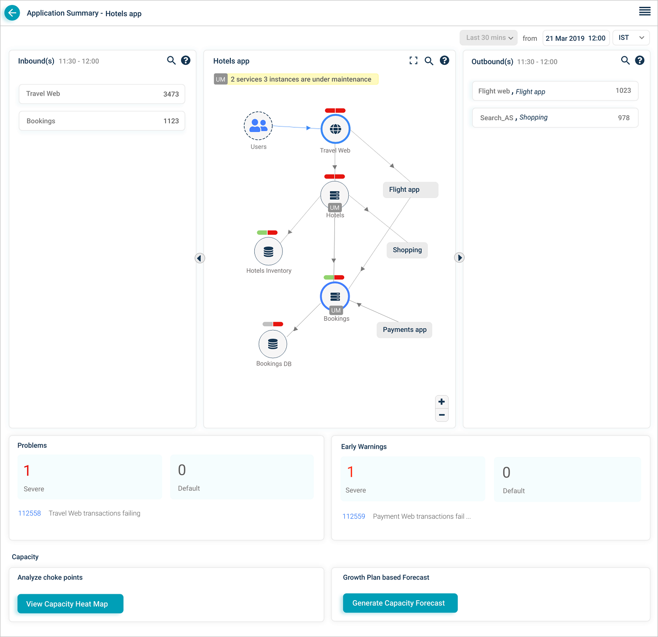
Long service names are truncated with a trailing ellipsis. Hover the short name to see the full name and instance counts (component and host).
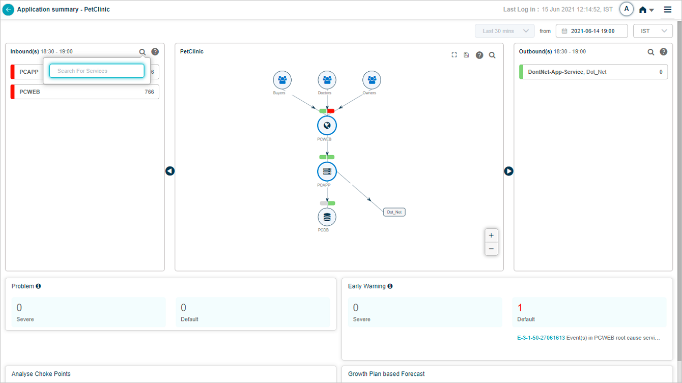
Search inbound or outbound services
Click the search icon to filter inbound or outbound services by full or partial name.
Inbound and outbound transactions
The Inbound(s) and Outbound(s) sections show data flow in and out of the application. Both display the last 30 minutes.
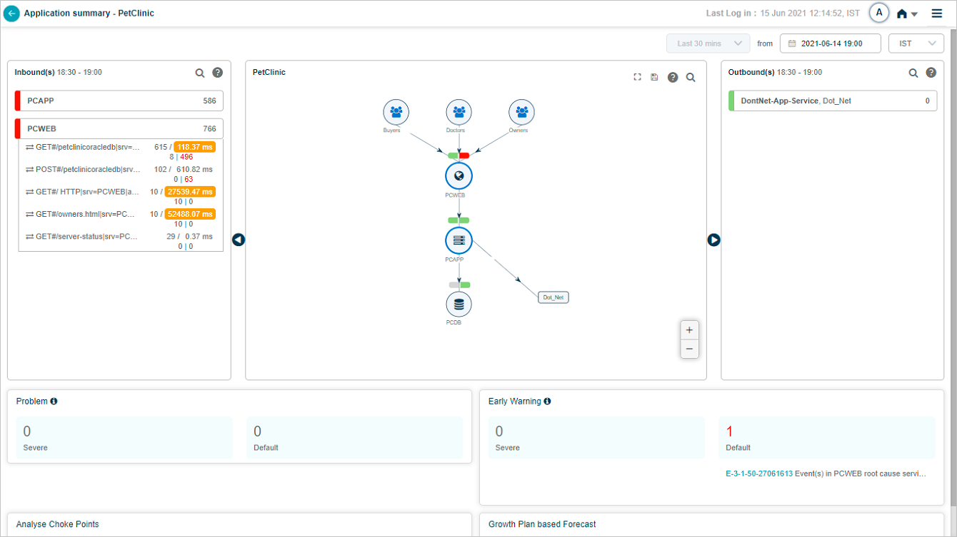
Inbound(s). Entry-point services receiving traffic for the application. The service is the destination for those transactions.
Outbound(s). Entry-point services of adjacent applications that the in-focus application talks to. The service is the source for those transactions.
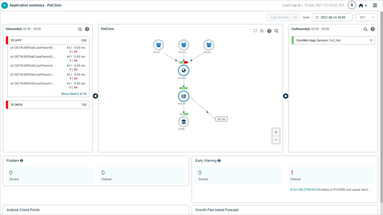
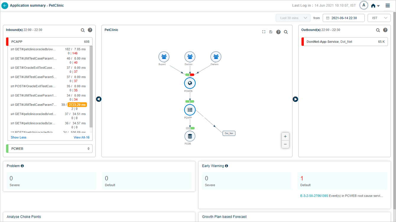
Click a service name to see its transactions. The list shows up to five transactions with events (red) first, then normal transactions. If no transactions have events, you see five random normal ones.
Transaction states
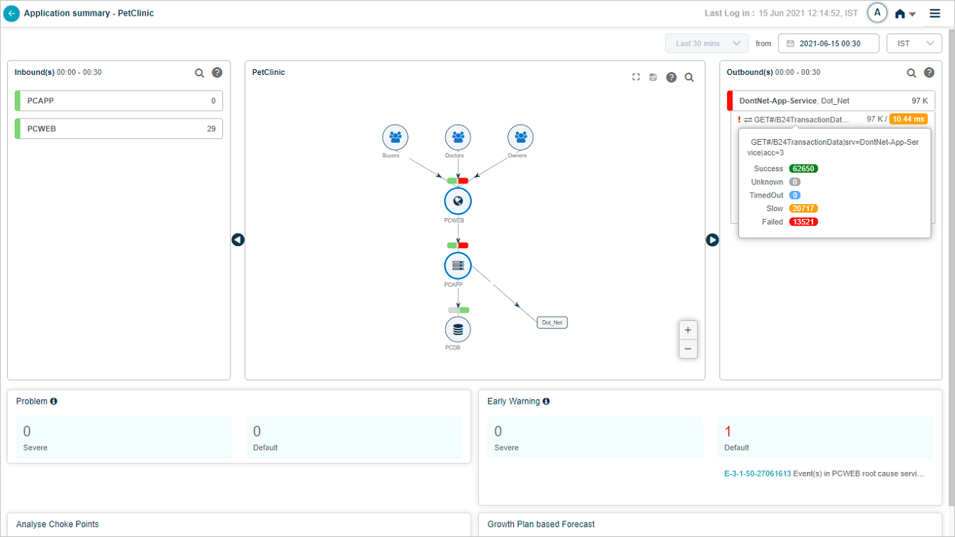
A transaction shows in red if any of these workload metrics breach the threshold.
- Success. HTTP status 1xx-3xx, no errors or exceptions.
- Slow. Successful transactions that miss the response-time threshold.
- Failed. HTTP status 4xx-5xx or any error or exception.
- Timed Out. The session timed out, or the request or response is incomplete.
- Unknown. The request started but the connection closed before a response.
A red strip on the left of the service name box means the service has events or failed transactions. Yellow means slow transactions. Green means everything is normal. Priority order is red, yellow, green.
Volume. Available for both the service and individual transactions. Inbound and outbound services sort by descending total volume.
Average response time. Across all transactions, in milliseconds.
Pagination
Show next. Appears when a service has more than five transactions. Click to load five more, then View All to open the Workload Request Dashboard for the rest.
Show less. Collapses back to the first five.
Hover any service in the Inbound(s) pane to see which application it belongs to.
Hover any inbound transaction to see its workload metrics.
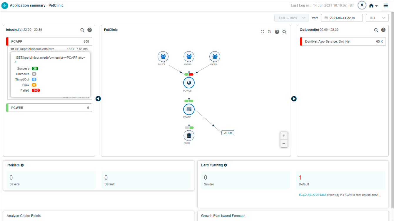
Slow transactions show their average response time in amber.
Outbound transactions
The Outbound(s) pane shows the service name and external application. Failed transaction counts are shown in red. A transaction with events shows a red exclamation mark.
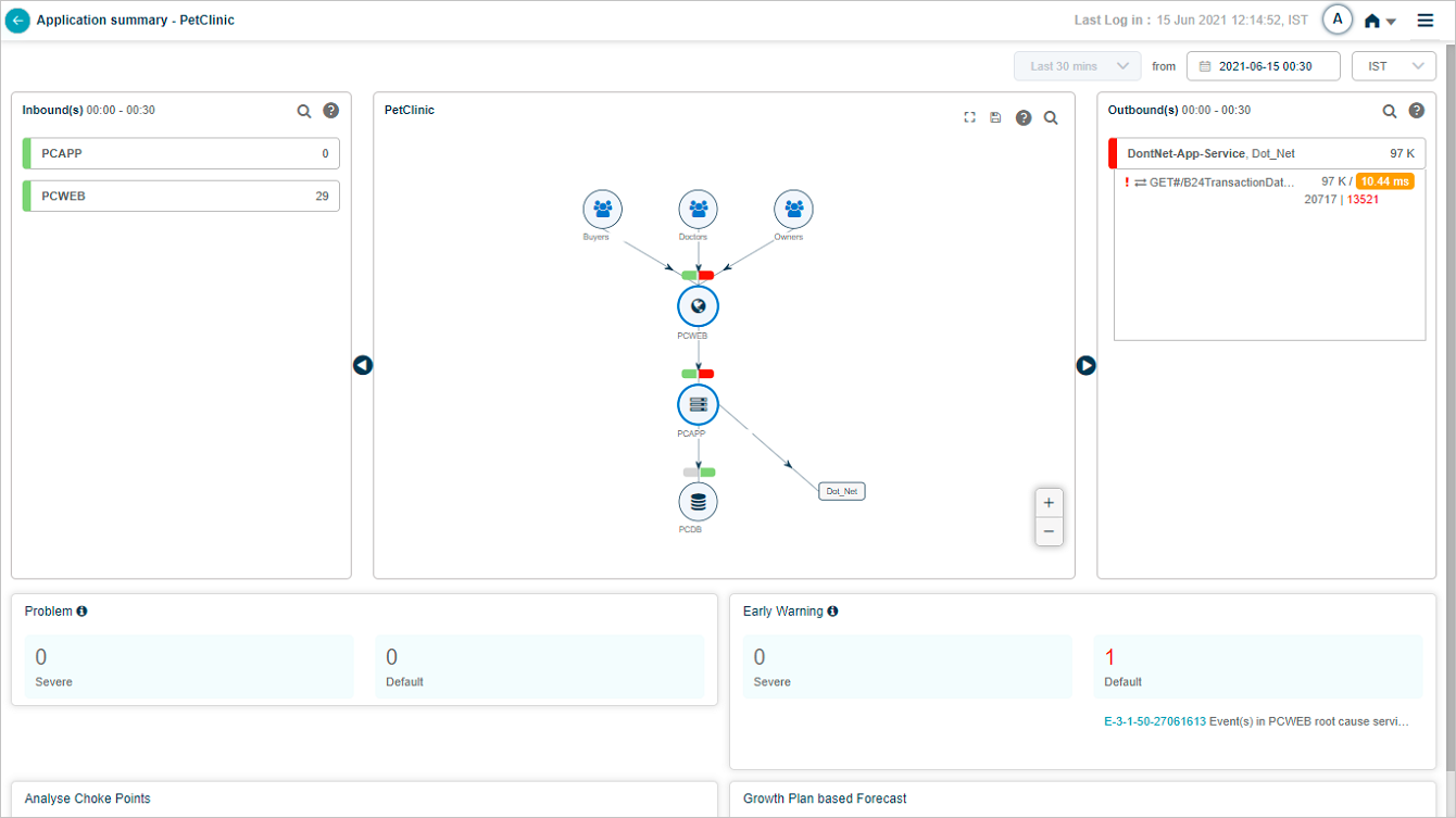
For each outbound transaction, slow counts are amber and failed counts are red. A red mark before the transaction name means it has events. Click the legend icon in Outbound(s) to see the legend.
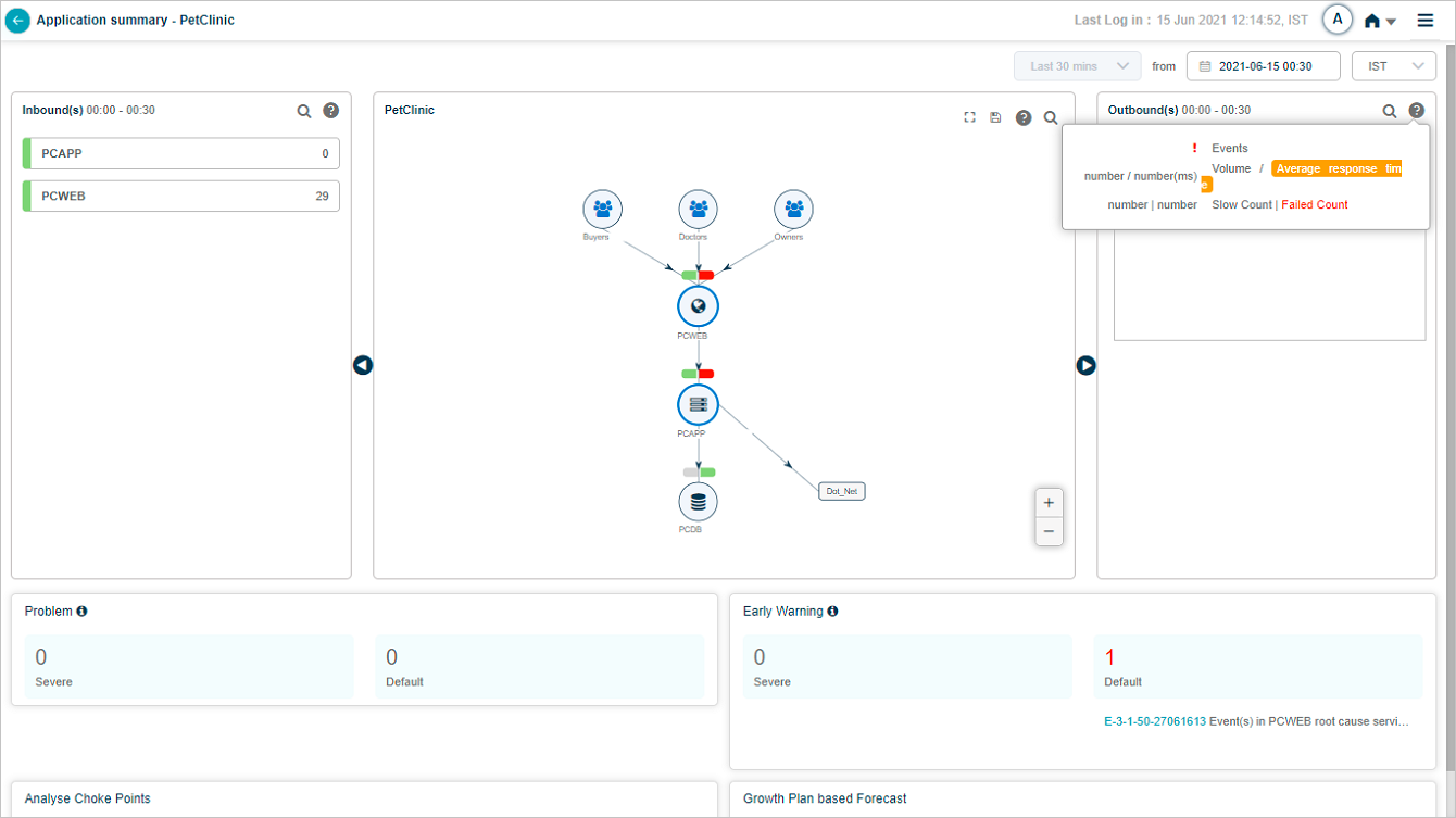
Hover a transaction name in Outbound(s) to see its workload metric counts.
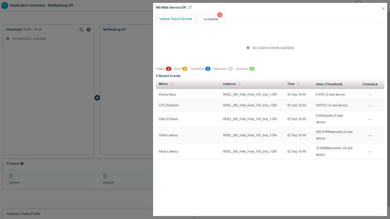
Transaction metrics
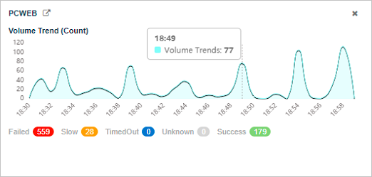
Click any capsule to open transaction metrics. You see the volume trend, counts of failed, slow, timed-out, unknown, and successful transactions, and details for the five most recent events (metric name, instance, timestamp, value, and threshold).
Hover a point on the Volume Trend (Count) graph for the total inbound transaction volume at that moment.
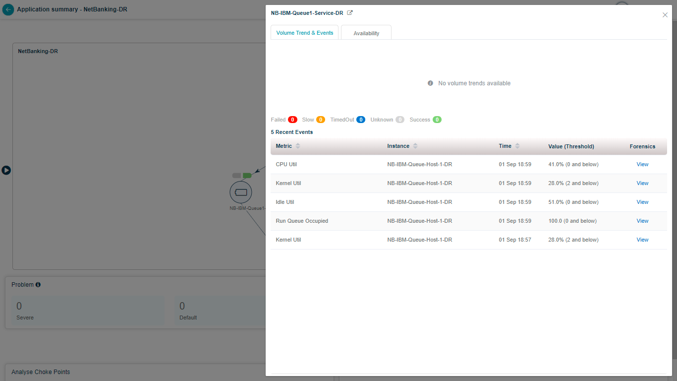
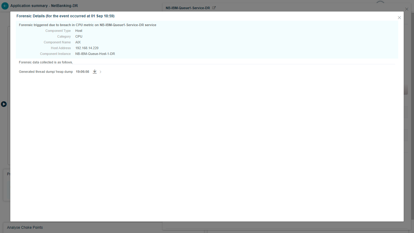
Click View to open Forensics.
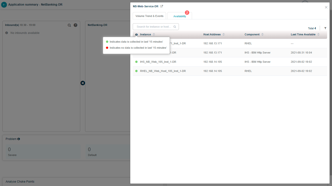
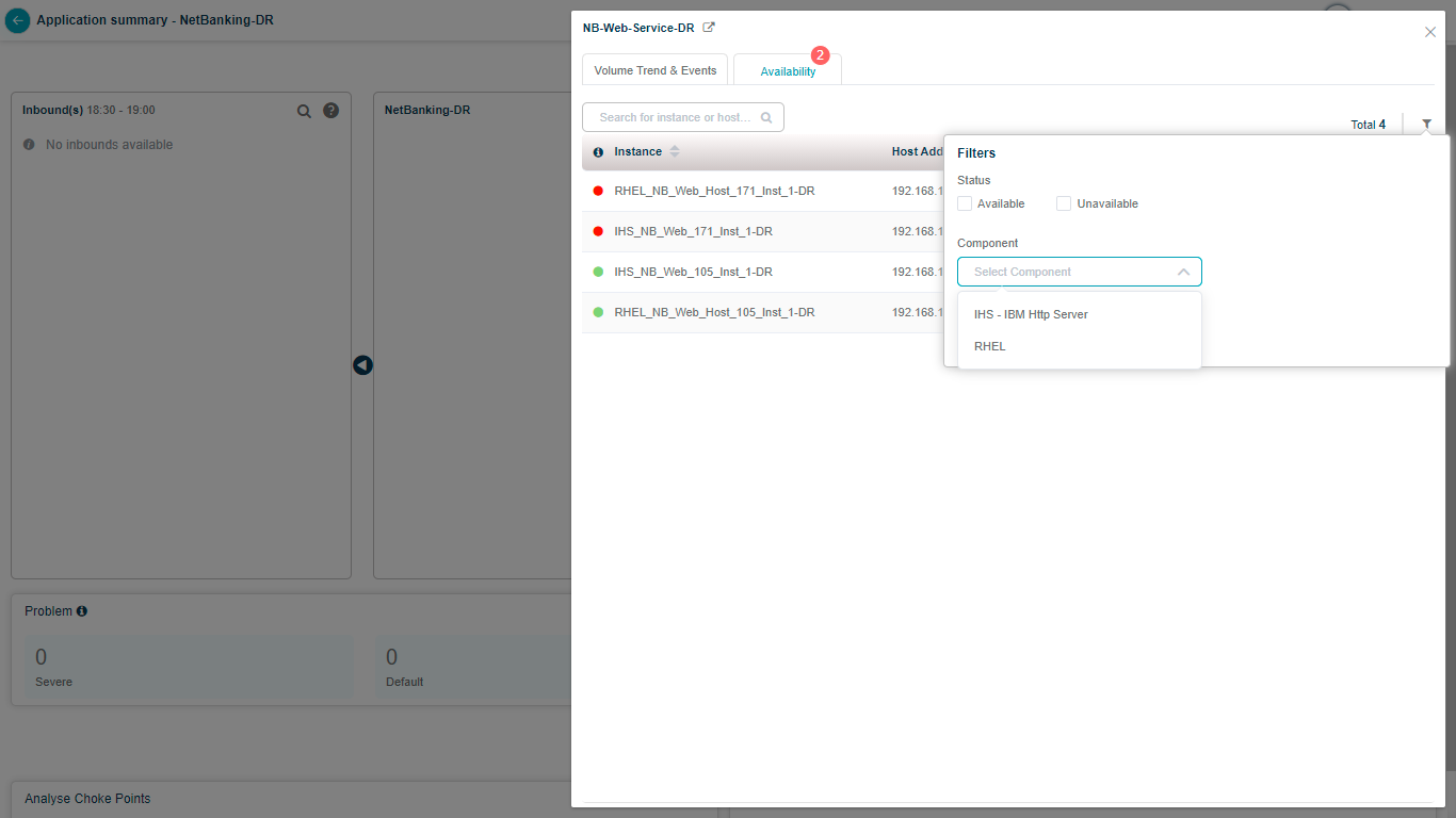
Server availability
Click Availability to see every host and component instance with its component type, the service it belongs to, the host address, and the last data-collection timestamp (last 15 minutes). You also get the availability status for each instance.
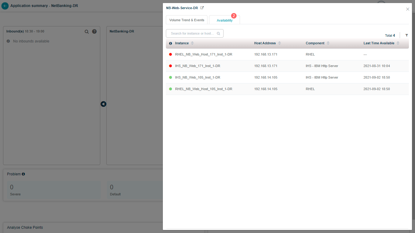
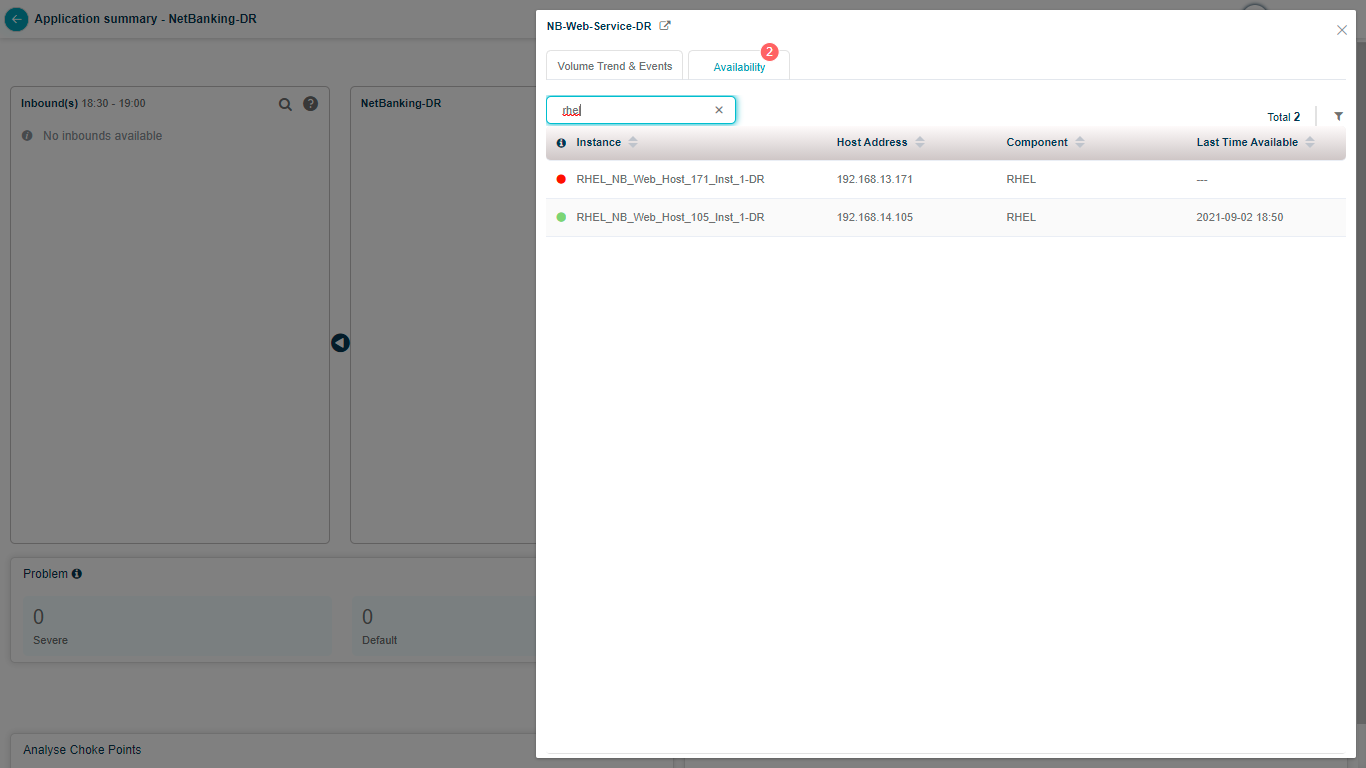
Search by full or partial instance name.
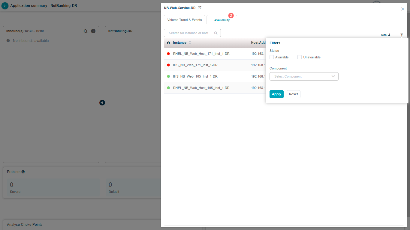
Filter the list to match your criteria.
Refresh the screen
Auto refresh
Hover the date and time link in the top-right to open the Auto Refresh and Reset controls. The slider switches auto-refresh on and off. When on, the screen refreshes every 10 minutes. Clicking Reset turns auto-refresh back on if it was off.
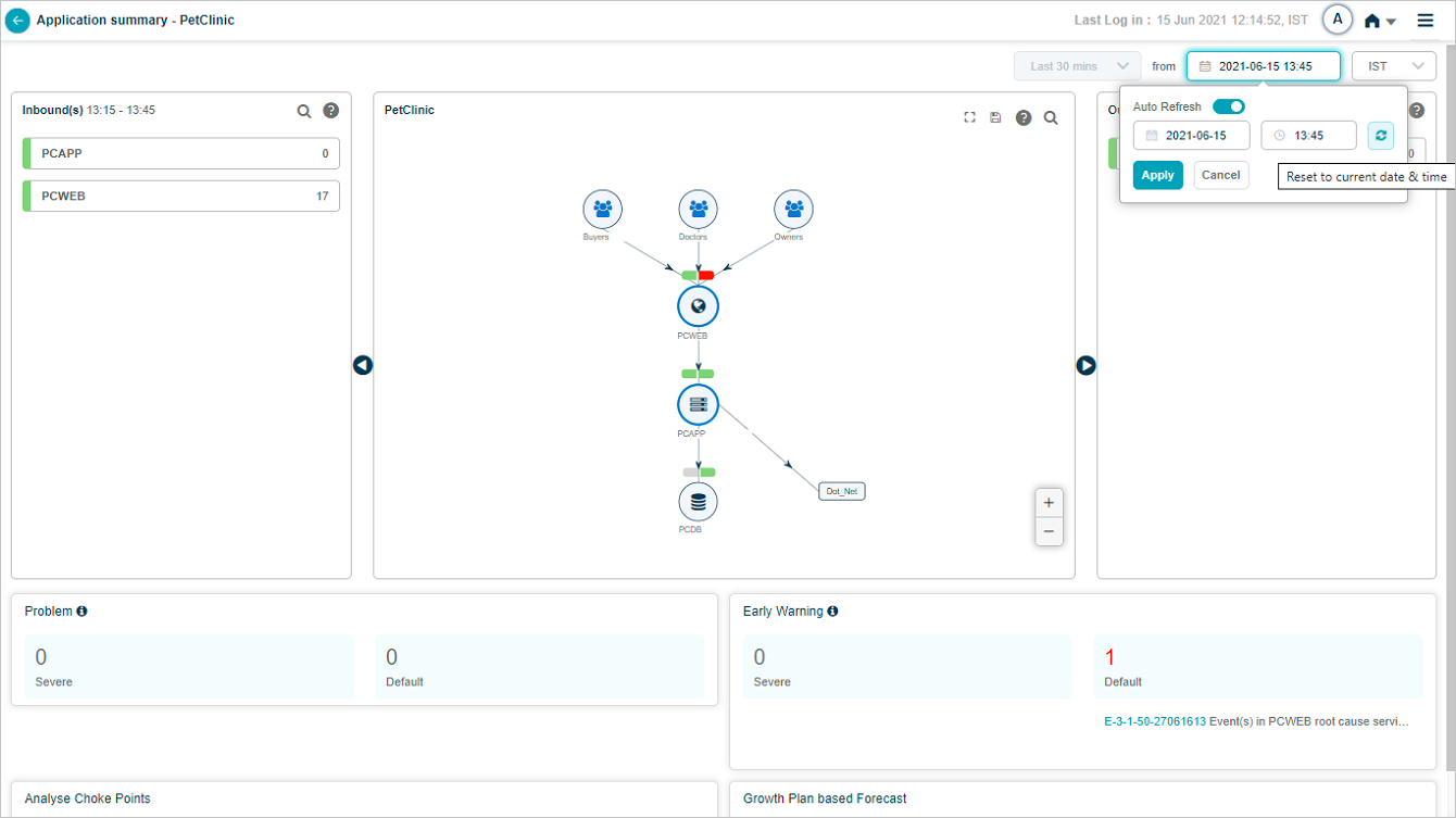
Manual refresh
Click the Refresh button next to Auto Refresh to reset the date and time to the current moment.
Help icon
Click the help icon to see what each entity in the SDM represents.
![]()
External dashboard link
If you have a Grafana dashboard for an application in HEAL, the Application Health Summary shows an External Dashboard link to that Grafana dashboard.

Batch enabled
When batch monitoring is on, HEAL shows counts of active Severe and Default batch problems whose start or end falls in the selected time range, with their IDs and short descriptions. Click any signal to open its Signal Report.
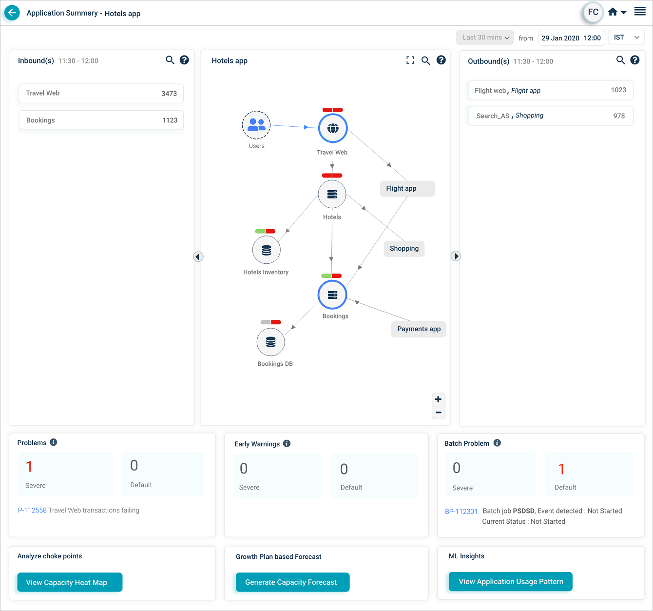
ML Insights
If Workload Signature Display is configured in the back end, click View Application Usage Pattern to see the application usage pattern.
Service connections
Hover any service circle to highlight its inbound and outbound connections.
Next
- Viewing Availability KPI . instance availability over time.
- Viewing Request Dashboard . workload request details.
- Viewing Forensics . event-level forensics data.