Search for answers or browse our knowledge base.


The Request Dashboard is the workload view inside Service Details. It surfaces every monitored request for a service, with breakdowns of slow, failed, timed-out, and unknown requests, plus an option to drill into a single request for response-time percentiles and code snapshots.
App owners, NOC, and DevOps users use it to understand workload patterns and triage performance issues. Different workload agents feed data in. Advanced agents like the Java Agent and .NET Agent unlock additional details such as code snapshots.
Service Details
Tagging and grouping
Workload agents auto-discover requests, so the list can grow large fast. Tag the requests you care about (for example, ATM transactions or POS transactions) and use the tag as a filter on the dashboard to narrow the list.
Request Dashboard at cluster level
Click any workload metric (Errors, Slow, or Volume) at cluster level in Service Details to open the cluster-level Request Dashboard.

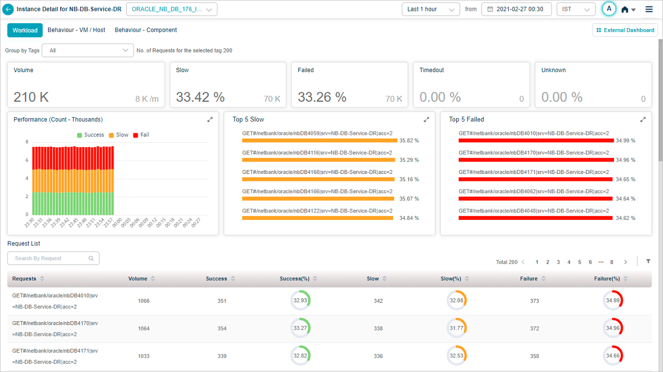
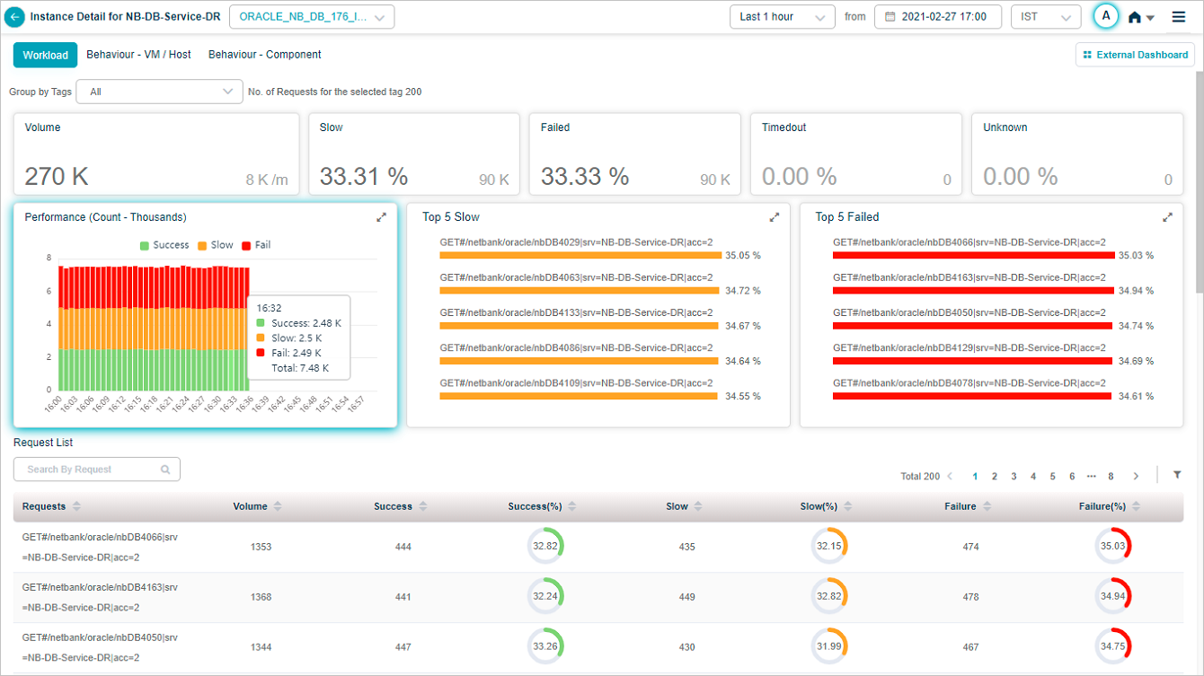
1. Volume. Total inbound request count for the service. Shows the volume trend and the per-minute arrival rate.
2. Slow. Total count and percentage of slow requests, plus the top five slow transactions. Successful transactions that miss the response-time threshold are slow.
3. Failed. Total count and percentage of failed requests. HTTP 4xx or 5xx, or any error or exception.
4. Timed Out. Total count and percentage of transactions whose response came after the expected response time. Includes incomplete request or response.
5. Unknown. Total count and percentage of transactions where the request started but the connection closed before a response.
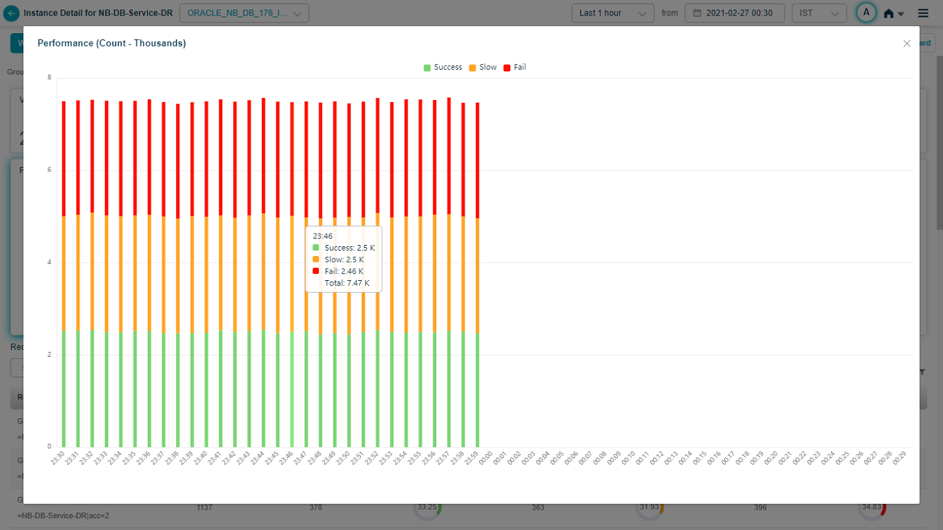
6. Performance. Per-time-segment breakdown of request performance.
7. Top 5 failed requests. Sorted by descending failure percentage. The percentage next to each request name is the failure rate for that request.
8. Top 5 slow requests. Sorted by descending slow percentage.
9. Request list. Every monitored request, sorted by descending failure percentage by default. Each row shows:
- Requests. Request name.
- Volume. Inbound count for that request.
- Success / Success (%). Total successful and the percentage.
- Slow / Slow (%). Total slow and the percentage.
- Failure / Failure (%). Total failed and the percentage.
10. Search. Find requests by full or partial name.
11. Filter. Open the filter panel.
12. Tag filter. Lists tags set for this service. Default is ALL. Pick a tag to narrow the list.
13. Tag count. Number of requests under the selected tag.
Hover any data point in the Performance pod for the per-segment numbers.

Filter requests
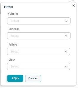
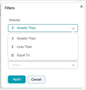
Filter on:
- Total request count
- Number or percentage of successful requests
- Number or percentage of failed requests
- Number or percentage of slow requests
With these comparison operators:
- Greater Than
- Less Than
- Equal To
View a specific request
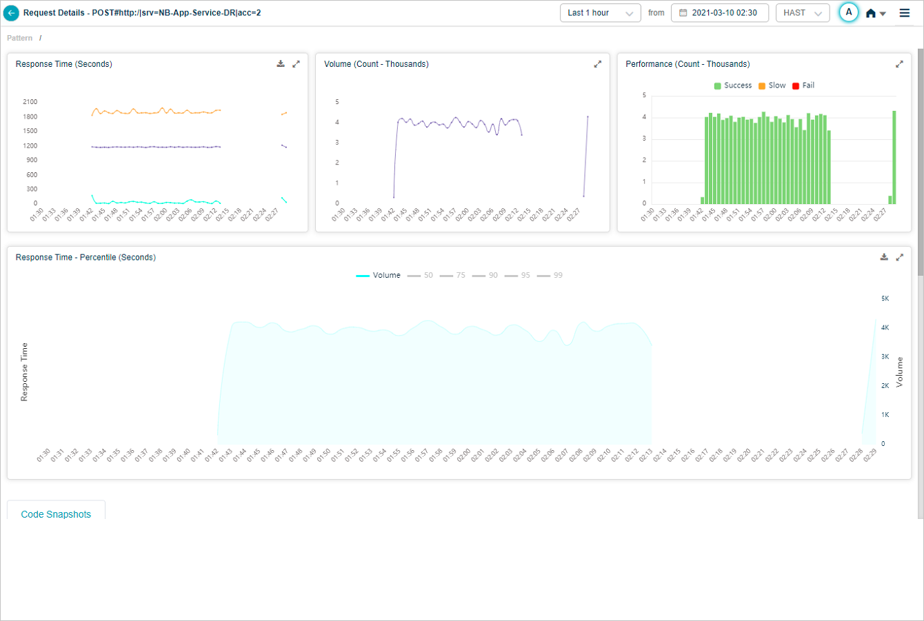
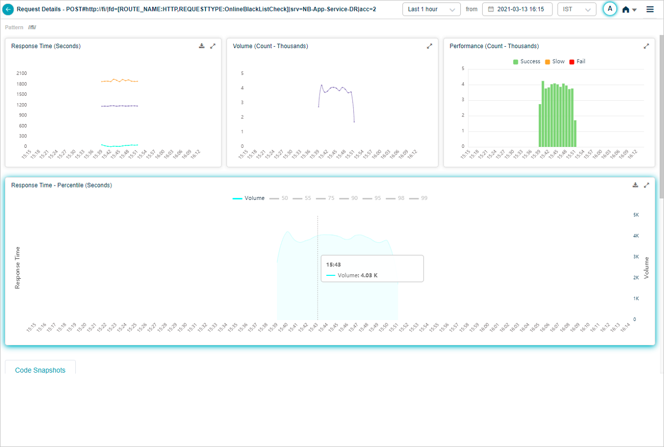
Click any request in the list to open a screen dedicated to that request.
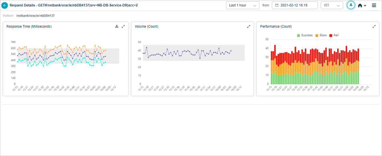
Hover any data point in the Response Time pod to see the request’s average, min, and max response time at that moment. Different instances of the same transaction can have different response times. Min is the lowest, Max is the highest, Avg is across instances. For a 24-hour period with one data point per hour, Max is the highest value within the last hour.
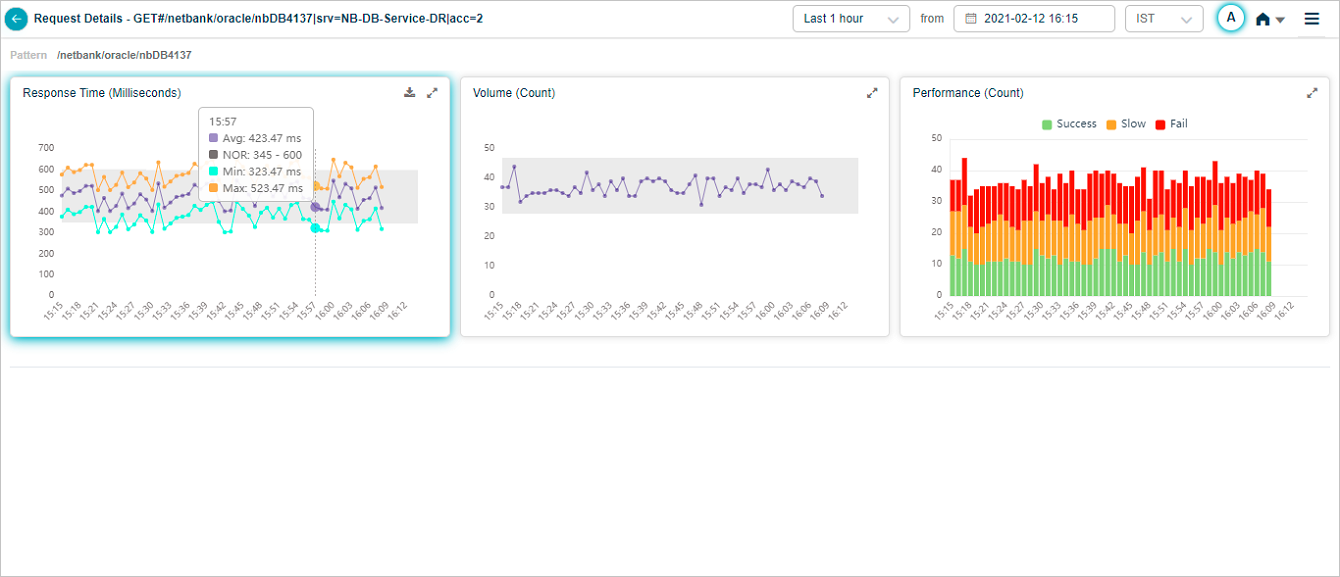
Click the expand icon in Response Time to open the full view.
Hover any data point in the Performance pod for the breakdown.

Response time percentile
The Response Time – Percentile pod shows response times for five percentiles. Default percentiles are 50, 75, 90, 95, and 99. Admins can configure up to five custom percentiles per application in the Control Center. If a service belongs to multiple applications, HEAL shows unique percentiles across all of them.
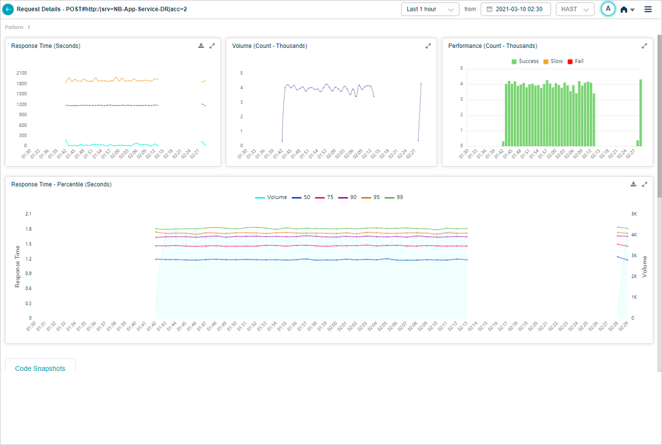
The Response Time graph appears only when HEAL has identified successful or slow requests. With only failed or unknown requests, the graph is empty. The Volume graph appears in both cases. Hover any data point to see the inbound request count and the per-percentile response times. Click the download icon to save as CSV.
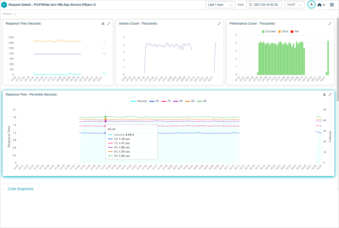
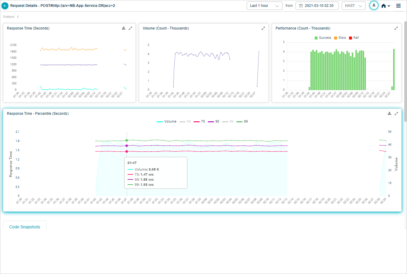
Click any percentile color bar to switch that percentile on or off. Disabled percentiles disappear from the graph.
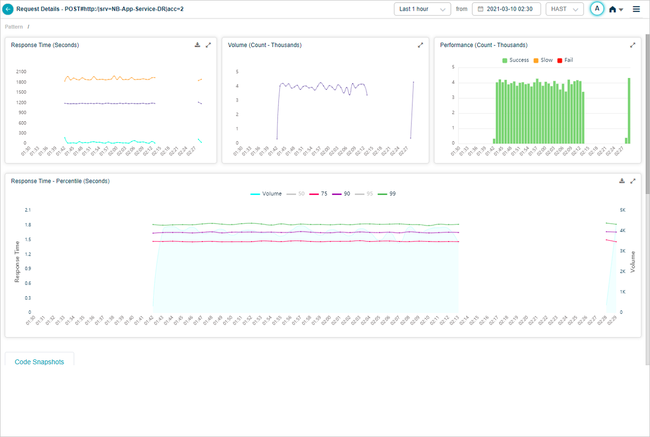
Hover any data point to see only enabled percentiles.
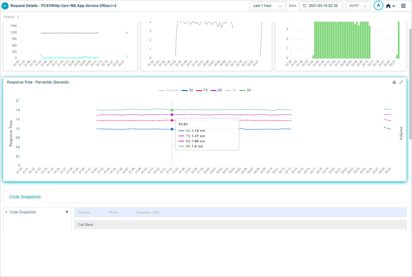
Disable every percentile to see the volume graph alone.
Hover any data point on the volume graph for the inbound request count.
Java Intrusive Monitoring (JIM)
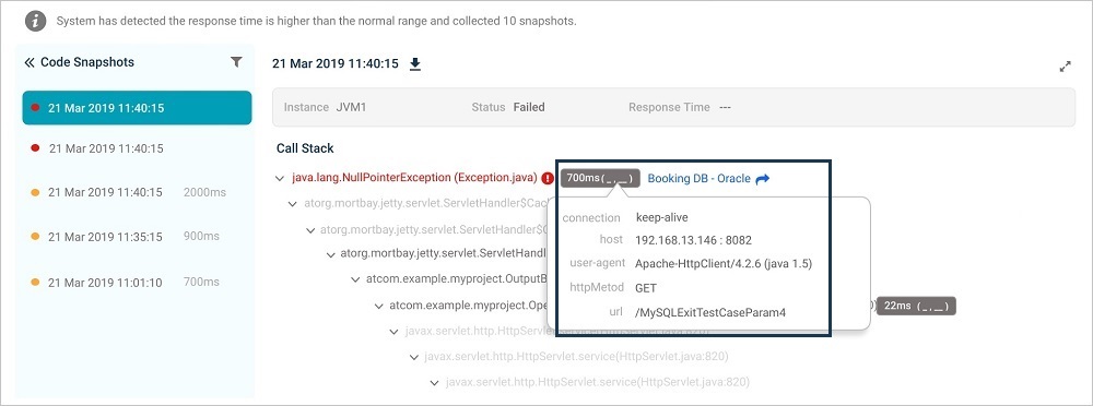
When JIM is configured for a service, code snapshots appear whenever a request slows down or hits a technical error.

1. Request. The monitored request, with payload data that distinguishes it.
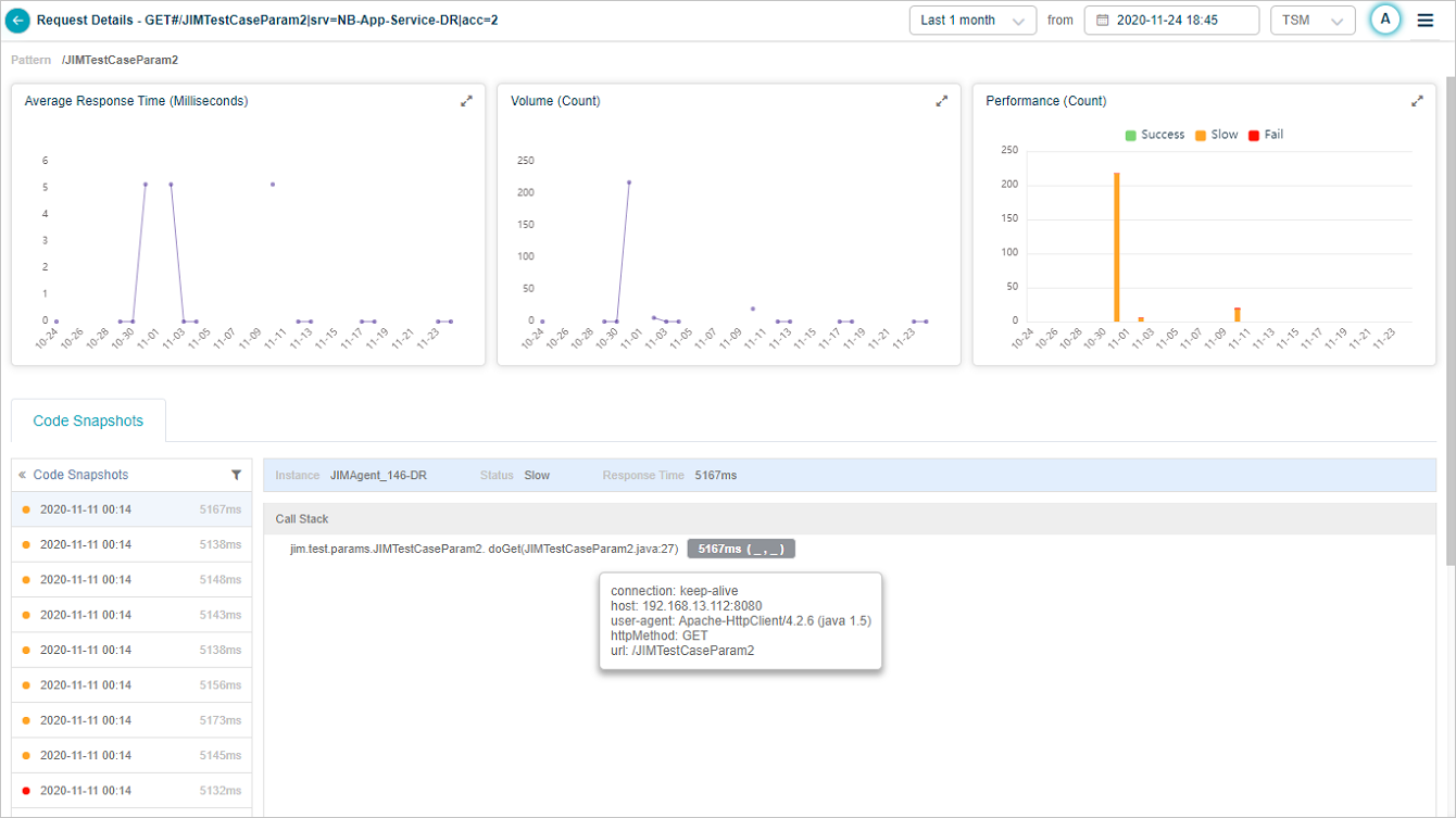
2. Average response time. Trend over the selected period.
3. Volume trend. Count of this request type over the selected period. New requests are added automatically as the admin creates fine-grained rules.
4. Performance breakdown. Per-time-segment performance breakdown.
5. Snapshots list. Code snapshots for this request in reverse chronological order. Shows the response time, the JVM that handled the request, and the status. Failed snapshots are red, slow ones are orange. The first snapshot is selected by default.
6. Call stack. The call stack for the selected snapshot.
7. Instrumented vs not. Instrumented methods are dark text. Non-instrumented methods are gray. The agent captured the snapshot but does not monitor those methods.
8. Captured parameters. Methods with captured parameters are marked. Each method’s response time is shown in milliseconds. Hover for argument names and values.
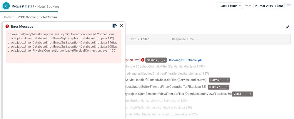
9. Exceptions. Marked in red. Click to see the error in detail.
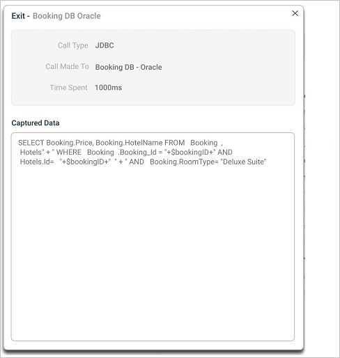
10. Exits. Marked in blue. Click to see the parameters passed in, the time spent, and the call type. Captured Data shows queries the exit ran.
11. Download. Save the call stack as PDF.
12. Filter snapshots. Limit to failed or slow snapshots.
Method arguments and values
Exit
Exceptions
Code snapshot for a slow request
Filter code snapshots
Open the Filters dialog to narrow the snapshot list.
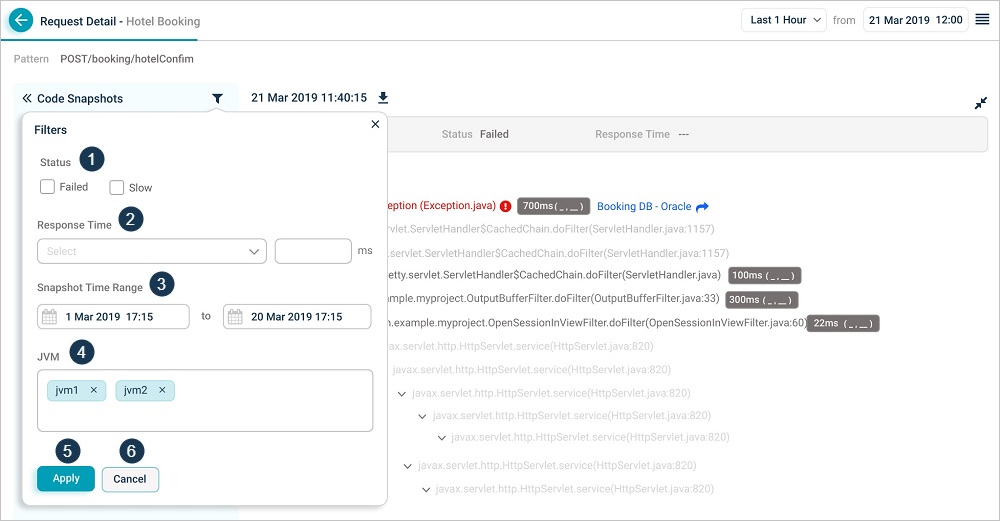
1. Status. Pick Failed or Slow.
2. Response time. Greater than, less than, or equal to a value you enter.
3. Time range. Start and end date and time inside the primary range of the snapshots.
4. JVM. Filter by the components (for example, JVMs) that served the request.
5. Apply. Apply the filters.
6. Cancel. Discard the filters.
Request Dashboard at instance level
Click any workload metric (Errors, Slow, or Volume) for an instance in Service Details to open the instance-level Request Dashboard.
Hover any data point in the Performance pod for the breakdown.
Click the expand icon in any pod to open the full view.
Next
- Viewing Application Health . the application-level dashboard.
- Viewing Availability KPI . instance availability over time.
- Viewing Forensics . event-level forensics data.