Search for answers or browse our knowledge base.


The Capacity Heat Map shows a weekly view of how often application or infrastructure capacity gets close to its configured limits. Only Capacity KPIs feed it. Each Capacity KPI represents a resource limit in the application’s infrastructure or code.
Open the heat map
1. Open the Application Summary page. See Application Summary.
2. Click View Capacity Heat Map.
Capacity KPI categories
Infrastructure level.
- CPU. KPIs for CPU consumption.
- Memory. KPIs for memory consumption.
- I/O. KPIs for I/O levels.
Application level.
- Application. KPIs for virtual resources like thread pool, DB connection pool, DB locks, and DB sessions.
What’s on the screen
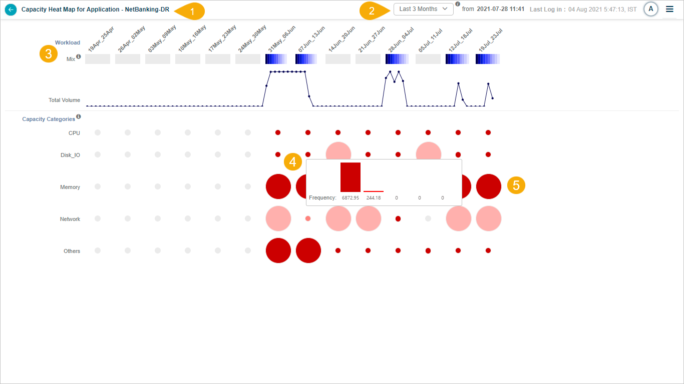
1. Application name. The application this heat map is for.
2. CF Baseline Timestamp. The timestamp of the last completed CF baseline. The duration defaults to the number of months covered by the last baseline. Available views: 1, 2, or 3 months. The baseline starts at the displayed date and time and goes back 60 days.
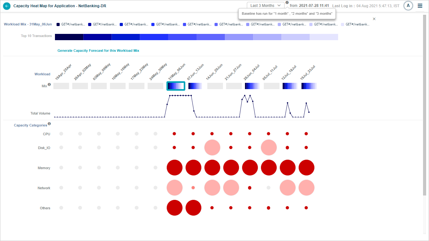
3. Workload Mix. A combination of transactions of different types. Shows volume growth over selected data points using a stacked bar of the top 10 transactions.
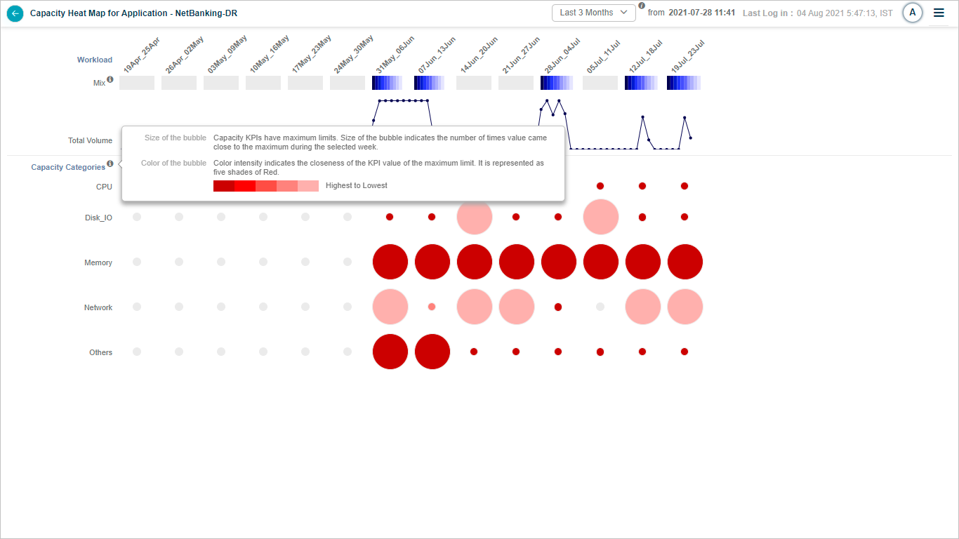
4. Bubble size in Capacity KPIs. The bubble size shows frequency, that is, how often the KPI value approached its maximum limit during the week. Hover any bubble to see five frequency buckets, with the first being the most severe and the last the least.
5. Bubble color in Capacity KPIs. Five shades of red. The darker the shade, the closer the KPI is to its limit.
Interactions
1. Baseline run months. Hover the information icon to see when the baseline was run.
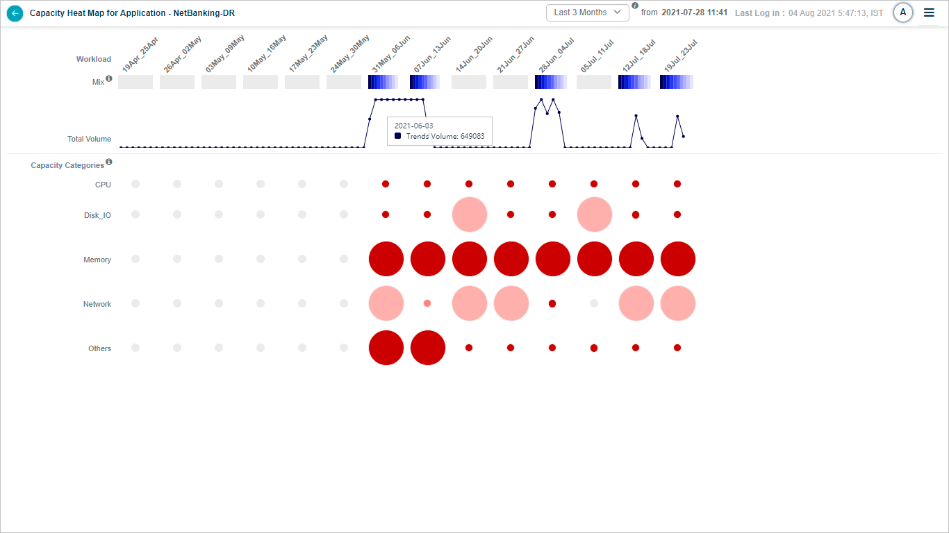
2. Total volume graph. Daily total transaction volume. Hover any point for the date and average volume.
3. Month selection. Pick the first, second, or third month relative to the date and time.
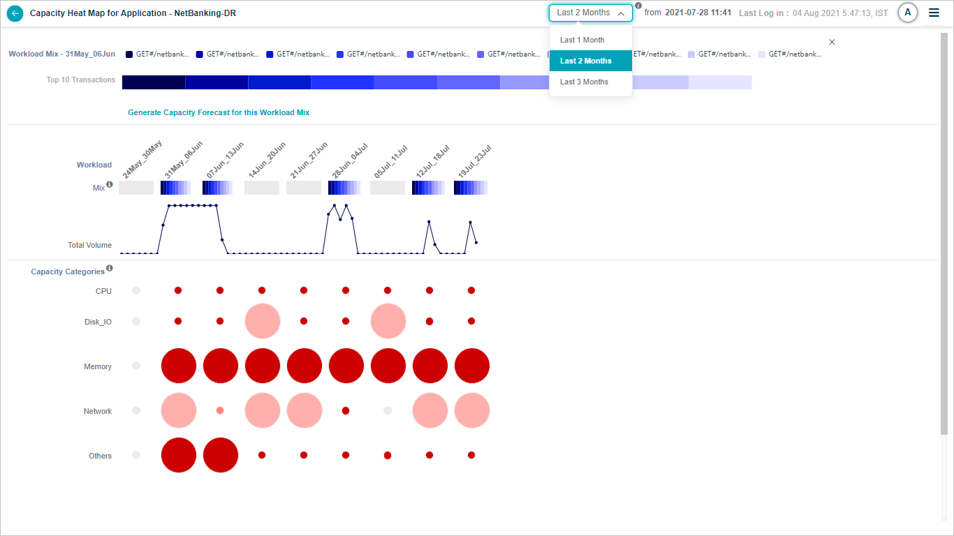
4. Disabled month. A month with no MLE baseline is disabled.

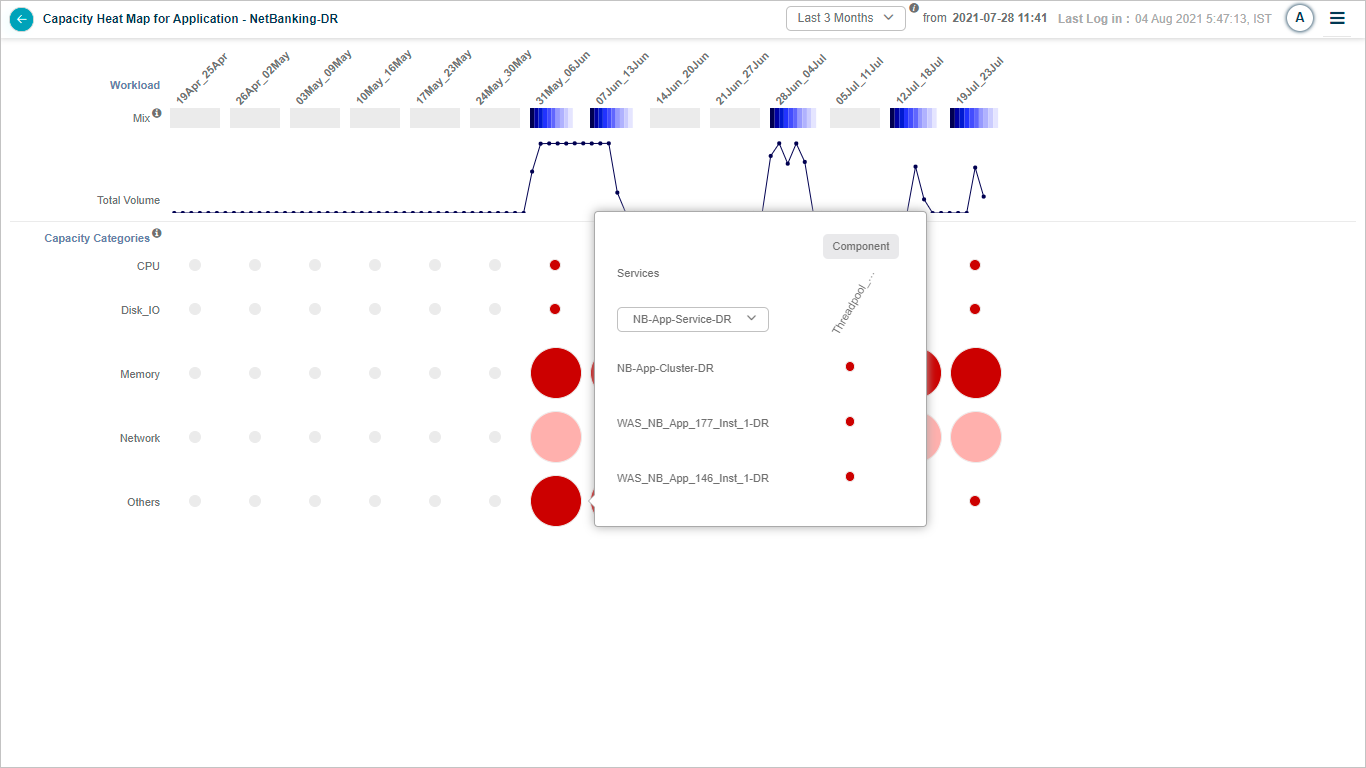
5. Bubble selection. Click any bubble to open a popup with:
- A list of services for the application. Click any service to open its details.
- A list of every instance behind that service.
- A breakdown of heat for each host and component-level capacity KPI for that capacity limit.
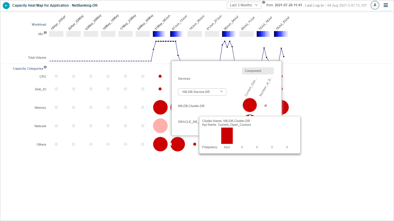
6. Instance-level bubble. Hover any bubble at the instance level to see:
- Service instance name.
- Host or component-level KPI name.
- KPI frequency.
7. Transaction mix selection. Pick a transaction mix for one week to drill in. Shows the top 10 transactions in a stacked bar. Hover any transaction to see its average weekly volume and average response time in milliseconds.
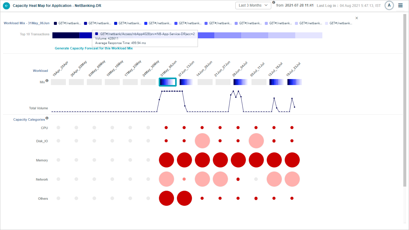
8. Workload Mix tooltip. Hover a partial transaction name in the Workload Mix to see the full name.
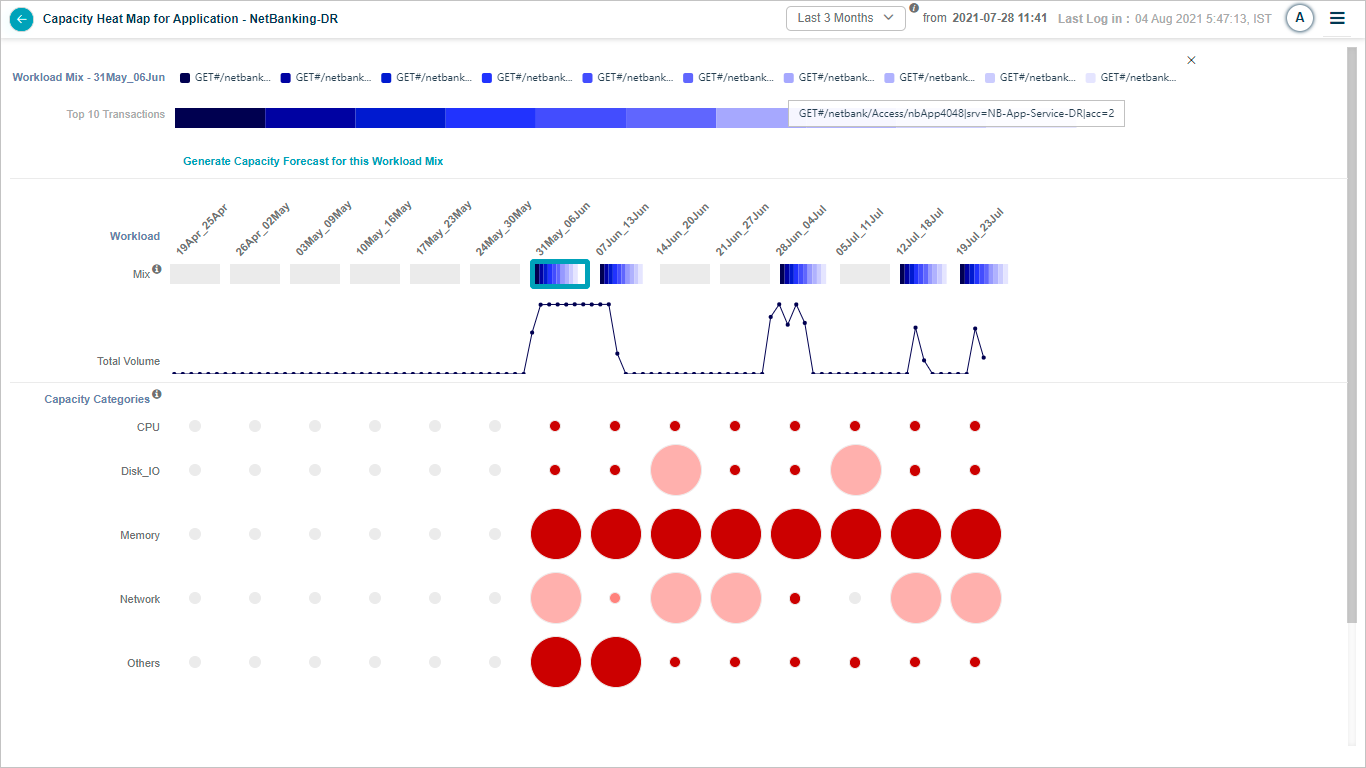
9. Mix section info icon. Hover for more details on the mix.
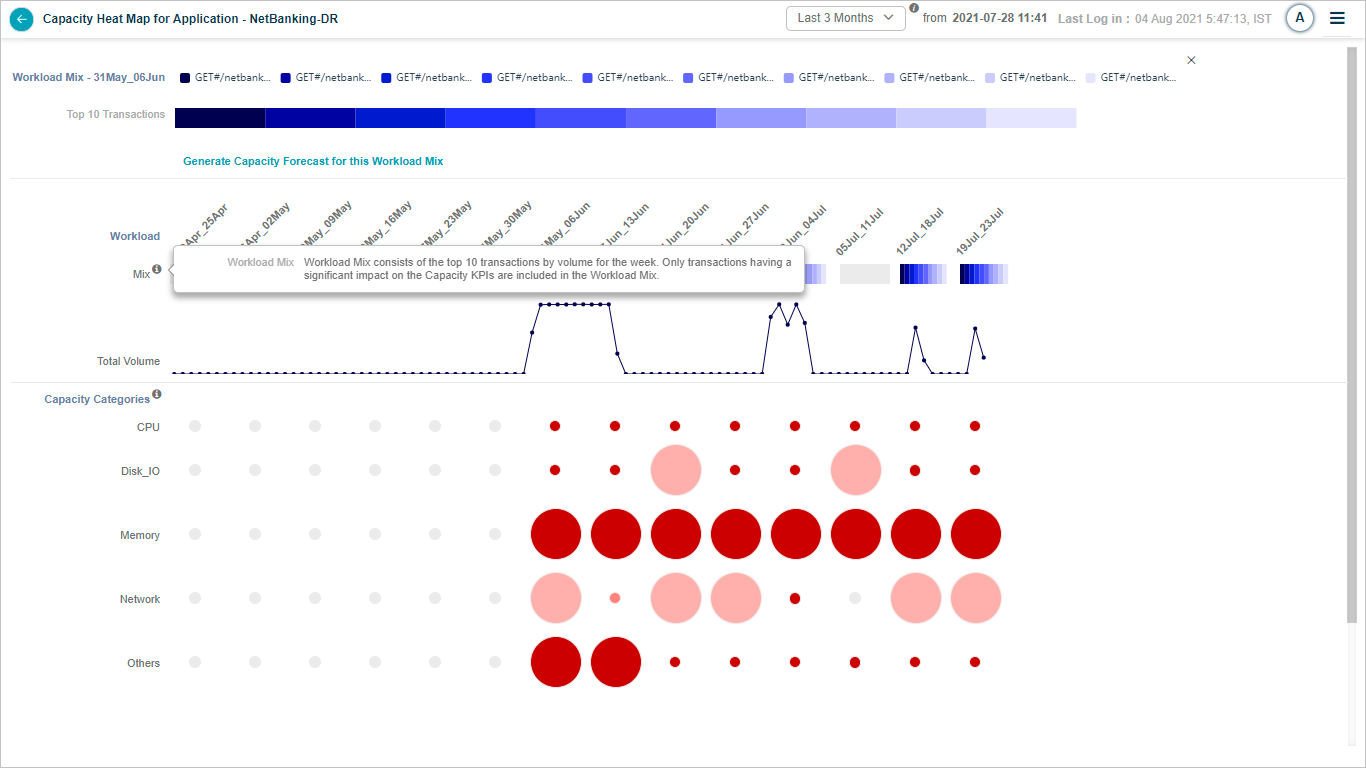
10. Capacity Categories info icon. Hover for more details on the categories.
Next
- Generating Capacity Forecast . build a forecast on a growth plan.
- Capacity Forecasting . full feature walkthrough.
- Application Summary . application-level drill-down.